2012年11月23日星期五

BLUE


The director of Movie "Blue" is Jarman. When he was blindness due to  AIDS, he taken this "autobiography", so that he wants to make more people know that what is death and what is AIDS death. When Jarman faced death, we could feel his contradictions: on the one hand, he thought that death was naturally, without any complaints; on the other hand, he had his lover, he didn’t want to lose. The movie was so immersed in the symbol of melancholy blue tone. He knew that this would be his last film, art techniques, "he refused to show images, landscape and the human body, pushed to the limit in the form of the movie"

Although he was blind not deaf. He said the color liked a blessing for him , but they continued to fade from his side. However, he had not see any color up to now.  But he would give audiences to see blue, because blue is a  pure color.  He said, white add the blue , which will be not dull. However, blue is similar to black. He think taht blue is a dark visible. As a result, The ad and the cover of the book use a lot of blue. The movie is so immersed in the symbol of melancholy blue tone. Blue is the color of the Shroud, is silent, the color of the crucifixion, but also the sky, the sea and larkspur color.

In fact, a variety of color could show different wavelength of the sound. For example, blue and black give people long distance. I can associate with the rhythm and color to express sound visualization.
I will deeply explore the psychology of the Deaf and explore different color give different expression of the sound.


2012年11月21日星期三

How does the gesture transform a sign?

In fact, sign language is very complex. Thus, I will simplify these gestures, making people easier to receive the information. I will taking the Anti-war logo for example, it associates two semaphores of the Navy, representing 2 letters “N” and “D” which is the first letter of “Nuclear” and "Disarmament”. It means anti-nuclear movement. This logo uses simple line to express gestures of these letters.


This logo is my exprienment. It designed for Beijing production safety supervision system, and the inspiration of the creation comes from the stopping hand signal of traffic police. The logo adopts the stopping hand signal of traffic police to indicate the prevention of unsafe production, and a -shaped silhouette reflects the concept of putting people first and safe development. The eye-striking color of bright red is mainly adopted for caution. The logo looks simple, and facilitates identification and publicity of the brand concept/culture. The use of positive and negative figures makes the logo look fresh and authoritative.


2012年11月15日星期四

The dance:" the Thousand-handed Goddess"


The dance called the Thousand-handed Goddess which performed by China Disabled People's Arts Troupe at the CCTV spring festival evening party 2005.
The dancers are 20 deaf people. When they were dancing, there were 4 people standing on the stage of the four corners. Four people used sign language to tell them the rhythm of the music.

There is a story about that, we know that they practice was very hard, because they did not hear the rhythm of the music. However, one day, their dance tutor saw four girls sitting next to large speakers, ear tightly close to the speaker, the kids want to feel the beat of the music through the speakers "vibration". Thus, when they practicedthey would turn the music loudly, and then, they lie on the floor, vaguely feel the vibration of rhythm through the floor. Meanwhile, they used film projectors to flash some imagery on screens, make them feel music.

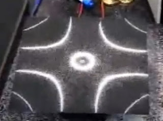
This case study make me think about Cymatics. It can express the patterns though vibration to realize the sound visualization. However, the deaf people can see the voice through sign language.

2012年11月14日星期三

In the land of the Deaf

Sign language is, in the hands of its masters, a most beautiful and expressive language, for which, in their intercourse with each other and as a means of easily and quickly reaching the minds of the deaf (Schuyler,1910). Therefore, I want to associate with sign language and other visual language, making deaf people easier to understand the information from the sound.


The documentary called “In the land of the Deaf” which features the stories of a family who has been deaf. They ate hearing-impaired people of all ages and from all walks of life. They communicate their dreams and thoughts through sign language. There is a thing I want to mention that the deaf children use sign language to learn sing. They try very hard to sing songs. If you turn off the sound, just see they face, you will think they are not the hearing-impaired people. However, in fact, they can’t hear anything and even only be able to produce a few simple sounds. They are terrific to use different gesture and enjoy it.
 
Moreover, it is an interesting thing that deaf people can communicate with each other through sign language, although they come from different countries.

2012年11月9日星期五

Cymatics


Cymatics is the study of visible sound and vibration, a subset of modal phenomena. Typically the surface of a plate, diaphragm, or membrane is vibrated, and regions of maximum and minimum displacement are made visible in a thin coating of particles. The metal sheet connects to a sound driver and being fed by a frequency generator. As the frequencies increase, so do the complexities of the patterns that appear on the plate. According to this experiment, sound could become patterns through vibrations.

However,when I first read of the deaf and their singular mode of language, Sign, I was incited to embark on an exploration, sound visualization, making deaf people see voice. Meanwhile, I want to build an interface of deaf and hearing communities. In fact, sound visualization uses different methods to generate animated imagery based on a sound. Therefore, I want to make sound more material by using visual language to express the sound for deaf people. However, how the deaf people perceive that world is and how they interact with that world. I will explore these questions.

Sensory design:Sound visualization-Sound Toys

Definition: Sensory design aims to establish an overall diagnosis of the sensory perceptions of a object, and define appropriate means to design or redesign it on that basis. It involves an observation of the diverse and varying situations in which a given product or object is used in order to measure the users' overall opinion of the product, its positive and negative aspects in terms of tactility , appearance , sound  and so on.


This advertising is designed by Studio Tonne. They associate geometric figures, different colors and movement to express the sound property of the toys. To be more specific, a variety of color could show different wavelength of the sound in this advertising, which can make people see different change of the voice from ad. I

2012年11月2日星期五

Sometimes I Wonder, Timothy Archibald


In Timothy Archibald‘s case, photography was a way of connecting with his autistic son, Eli. Archibald says, “I knew he was tuned differently, and I needed to build a bridge, get inside his head, learning what made him tick.’’ He thinks autistic children always shut themselves up in their small world. To communicate with them seems like being in the foreign country (language barrier). So the image could be the best way to understand them. 

However, for blind person, visual language could not be an effective way to exchange. We usually find that there are blind tracks on the pavements of the major urban roads. And some designers could associate with their work and braille to communicate with blind person. In fact, accessible design could be an interesting case to study. Because people can choice different way to receive the information, such as: sight, touch, sound and so on. Graphic design can use visual imagery, materials, printing technology to achieve an exchange of ideas. Maybe we will explore more medium to communicate with people (including the special group) in design in the future.

In addition, Archibald considers that the power of having experiences is the sharing of the experience. It can help others navigate their own situations. I absolutely agree with him. I think we can design our work though our experience, which could kill distance between designers and audiences.

2012年11月1日星期四

Sur les traces des révolutionnaires de 1789 by Cedric Grimoult

Sur les traces des révolutionnaires de 1789 by Cedric Grimoult


Paperback
Publisher: Bréal (6 Oct 2003)
Language:French
ISBN-10: 2749502497
ISBN-13: 978-2749502496
Product Dimensions: 21.2 x 12 x 1.2 cm


I read the its Chinese version《追踪1987法国大革命》. (I can't find its English translation<Over the traces of the French revolution 1789>!!! 
It is not only the history book but also the Table-top Role Playing Game. It invites every reader to participate in it as an influential revolutionary. Compared to other RPG, you can experience this period of history, you can choose the role of French revolution whatever you want to act in this game. You, however,  can't change the result like <The Monopoly> . What's more, it is easy to remember the history because you have personally experienced yourself.

2012年10月27日星期六

Green Pedestrian Crossing

Brand China Group Shanghai for the China Environmental Protection Foundation


The China Environmental Protection Foundation wanted to encourage people to walk more and drive less.

In this case, they use a busy pedestrian crossing where both pedestrians and drivers meet. They cover the crossing with a giant canvas of a large leafless tree. Placed on either side of the road were sponges, cushions soaked in green, environmentally friendly paint. As people walked across and stepped onto the sponges, they created green footprints. Each green footprint added to the canvas like leaves growing on a bare tree, conveying the message that walking helps create a greener environment.


Environmental protection has become people's popular topic all over the word. As result, designers want to appeal people reduce pollution in their work. However, posters could not give people a deep impression. If people could participate in this advertisement, I think it will give memorable moment for visitors.

I always want to find a way to express a change process in a paper. I think we can show it except using video. Take this case for example, people’s participation make this tree turn green. In other words, it is changing on a paper. This discovery makes me excited.

"LIGHT MUSIC" by Lis Rhodes


Among the works on display was "LIGHT MUSIC" by Lis Rhodes. I went along to have a look - and take part. “You are the Artist,”said the gallery. “You are the Artwork. You are the Audience.”

In this work, two film projectors flash black and white lines on screens at opposite ends of a smoke-filled room. You - the viewer - take part in the action and enjoy it. Moving between the flickering and flashing light beams you cast shadows - ghostly images in the fog - images from another world.

Tate Modern says "LIGHT MUSIC" is a classic example of expanded cinema. In Japan the audience sat down and watched. In Athens they got up and danced. Visitors can see how I and other people in London reacted to "LIGHT MUSIC" if they look at the photos they took in that smoke-filled room.

For a few fleeting seconds I became a huge work of art up on the walls of Tate Modern along with thousands of other people. I was interested in this way.

2012年10月25日星期四

"Manifesto for the Book“ Irma Boom


This book is bout the Portfolio of Sheila Hicks who is an American fiber artist, she usually studied a variety if industrial methods to make her work. It’s the book’s edge that reflects her style of work.

In relation to this book, this book’s rough edge echoes the frayed edges of her work. In addition, the cover of this book doesn’t have any decoration, including the title.
I believe this book design is very successful. Firstly, this book uses their material and printing technology to give reader different feeling. Next, the choice of material accords with the content of this book. People can easy to understand some information about Sheila Hicks and her works.

As Boom says: “My books are all industrially made. What you see is that the book is not simply a book; it’s also an object. That’s what makes it special.In fact, book is a very slow and still medium. We can select different materials and printing technology to give readers diverse tactile and visual sensations, which is one method to covey information in graphic design. We should study different medium to achieve communication.
 

My work( map): THE WAY HOME

In the past, family was a very important concept in people’s minds, and it was the center of many people’s lives. Nowadays, however, the relationship between family members is not as close as before.
I want to design a map which is the route from my home to my grandfather’s home. And I will talk about my story in this map, using my experience to enable spectators to think about a question: what factors cause them ignore their families.
To be start, there is a thing I want to mention is that my grandfather passed away suddenly on 7 January 2009. But our family members were all not there on that day. And I haven’t visited him for 1 year. I regret that I didn’t tell him that I love him and I asked myself constantly “Why did you go home to visit your grandfather? Why?” Maybe I have some factors, for example, I need to go to university to study, finish our class tasks. Sometimes I want to go shopping to release heavy study pressure. Sometimes I want to go travelling on holiday. However, these are all excuses. In fact, it just only takes me 45mins from my home to my grandfather’s home by car.
Next, I did some research on the Internet, the following reasons lead to this phenomenon that they ignore their families. Firstly, people face fierce competition and suffer from great pressure. They have to work and study hard meet the demand of the society. Secondly, there is more entertainment form available. My brother was addicted to play computer game. And he was playing games outside when my grandfather passed away.
I have a plan to do my project step by step. Firstly, I will download the route of map from my home to my grandfather’s home. And I will mark some place where I usual visit. Secondly, I will explore some methods to express this story in my project. Finally, I will draw it. But now I will solve a problem: how to express a process of change on a paper. Maybe I need to try different materials.
 

Marina Abramović Live at MoMA


3mins

12mins
18mins

29mins

164mins

From March 14 to May 31, 2010, the Museum of Modern Art held a major retrospective and performance recreation of Abramović's work, the biggest exhibition of performance art in MoMA's history. During the run of the exhibition, Abramović performed "The Artist is Present," a 736-hour and 30-minute static, silent piece, in which she sat immobile in the museum's centre, while spectators were invited to take turns sitting opposite her. A support group for the "sitters", "Sitting with Marina", was established on Facebook as was the blog "Marina Abramović made me cry". 

In fact, I didn’t find any information about the reason why spectators cried when they stared at Abramović’s eyes. And I didn’t visit this exhibition. I actually image more like a kind of film set. There is a huge square of light. And just that square, like lost in translation, in some way. It's so simple, it's like nothing there. It's just artist sitting like mountain. Looking you in the eyes, people don't understand that the hardest thing is to actually do something which is close to nothing. There is no story, any more to tell.


The most important point is communication in design. But sometimes we can’t use our work to communicate with spectators directly, and we need talk about some background about our work to audiences. However, Abramović did nothing else but communicating in how they were breathing or other tiny things with visitors. Therefore, we should explore this question how to achieve exchange of ideas in design.

2012年10月20日星期六

QMary:finding your way through borders and filters


In this design, it associates with map and board game to express its theme. It tracks border policy, labor conditions on campus, resistance movements, and helps us re-orient ourselves within British university. In addition, this map was inspired by all those who resist the border, our experiences of education and our migrations from various locations on and off it.

In analyzing this work, there are plenty of words, except green line. Meanwhile, this route is very clearly and the color is so striking. However, if we put the rule of game and the introduction of characters on the back of this page, it will be more perfect.

In my opinion, evaluating whether the work succeeds is communicating the message effectively. It is very important to interact with audiences in a design. People will get the type of communication they need though playing this game. In fact, people can have deep impression about some information, if they experience it. I like this work due to this point.

All in all, we can use different ways to tell a story, such as game, maze, illustration, poster and so on. We must explore different medium and find best fit way to convey our theme.

2012年10月15日星期一

London transport_Traffic Problem

 
Victor Galbraith, 1959
<The better way is to stagger your working hours>
Another approach to reducing peak traffic urged passengers to stagger their working hours. Galbraith uses caricature form to spread this message simply, using an eye-catching and bold design. And the logo of London underground replaces tires, which enable people easy to understand the theme of poster.
William Kerridge Haselden, 1920
<Traffic>
As commuter numbers increased throughout the 1920s, so did overcrowding during peak travel times. This poster reminds passengers to travel at off-peak times where possible. In addition, Haselden also uses illustration to show this traffic situation.
Aldo Cosomati, 1927
<The pulse of London life>
This poster presents the fluctuating numbers of passengers each day on London's Underground and Bus. Red and blue stand for the London’s bus and underground respectively. What’s more, times and causes of peak traffic are highlighted, encouraging passengers to reassess their journey.

From above three posters, I feel that caricature form is fantastic way in design, which is amusing and makes people receive information rapidly. Furthermore, designers’ inspiration usually comes from their lives and experience (including traffic problem). Maybe designs can’t solve that question, but they can arouse people’s concern. For example, people just know that they caught by traffic jams, but they are not realized that the important reason which leads to traffic jam is they perversely likes to travel at the same moment.